Risograph: Colour, Printing, and File Set-up
- Page size: 8 x 5 inches (an 8.5 x 11 inch sheet folded in half and trimmed).
- Finishing: perfect-bound
- Margins and bleed: 0.25”. We have a border around our pieces, so no bleeds (unless you don’t mind the border), keep it within a boundary, use a background colour, etc.
- Finishing: perfect-bound
- Colour: 2 colour throughout, double-sided
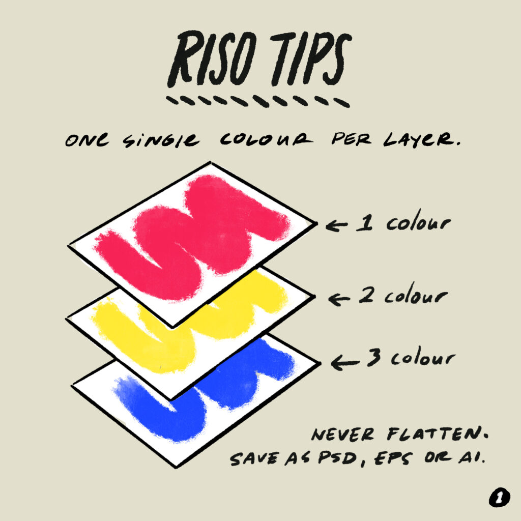
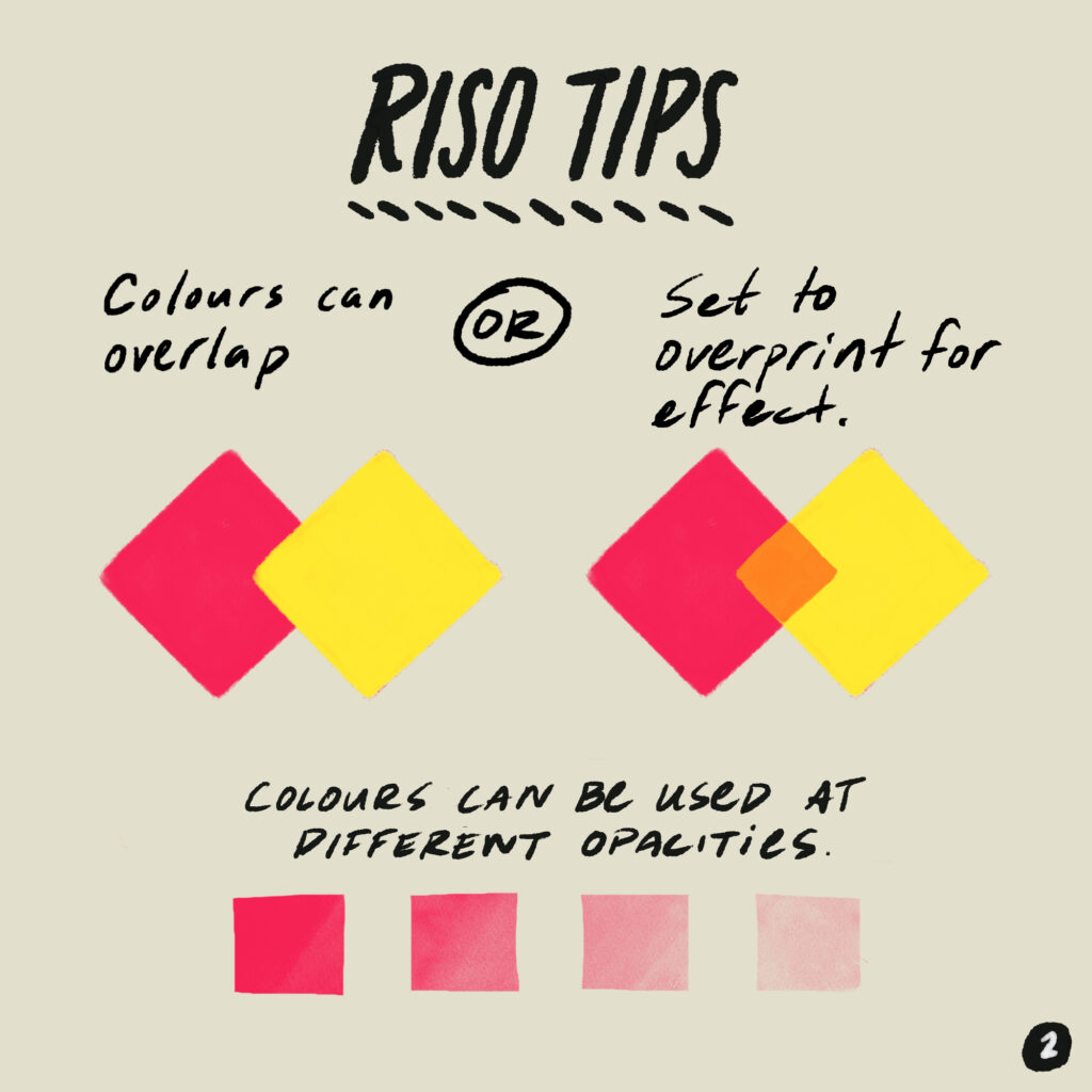
- File format: For illustrations that are made in vector format (Adobe Illustrator or any other software), please keep them in whatever file format they are in, and do not import it to Photoshop. Photoshop rasterizes vector files, and the quality degrades a bit. If your piece is accepted, we will need a separated file from you, meaning each colour needs to be in a separate layer, no two colours in one layer, and no flat jpeg or pdf files. psd or ai files are best. Contact us if you have any questions!
- If you are working in Photoshop, please use 600dpi as the resolution.
- More information about file set up for risograph printing can be found here: https://yolklesspress.com/file-setup/
- If you are finding it difficult to set up your file for riso, you can send the artwork to us (and Yolkless Press) to format it. We strongly encourage artists to at least keep separate layers for each ink colour as you prepare your artwork. We (and the folks at Yolkless Press) can help with file set-up, and technical specifications, around colours and incorporating drawings. Just ask!
We print with Yolkless Press, a small (and lovely!) artist-run risograph press. There is a learning curve to creating illustrations for riso. Here are some tips, illustrated by Michelle Campos Castillo.
Hungry’s Approach to Editing
We are a small two-person team, so we do what we can! Our approach to editing is to do light edits that support your voice to come through. We mainly edit for clarity, consistency within your piece, and typos. We then share it back with you, and you approve it. We work with a designer to lay everything out, and then we send our files to Yolkless Press to print.
- We are interested in the process of learning about publishing as an avenue for social justice, conscious language, and radical copy-editing.
- We want your authentic voice to come through as a writer or illustrator. This means:
- We will make light copy edits that support your intentions within your piece
- We edit to consistency within the piece
- If we propose larger edits, it is with an eye to providing greater clarity
- When it comes to words/content in languages other than English:
- First, we follow the author’s intentions
- Otherwise, if you have no preference or aren’t sure what you’d like to do, we choose not to use italics, quotation marks, or other differentiators. We believe that this exoticizes words in languages other than English, and we want these words to have equal weight.
- We exist because there is a need to unpack and dismantle racism, white supremacy and colonialism in food writing. It is important to us, where possible, to intentionally name settler colonialism, dispossession of land, violence, colonialism. We know that this is a difficult process, and also may be new to you. We are interested in working with people who are open and willing to engage with this, and we will support you to the best of our abilities and capacities to work this into your pieces.
- We’re fans of the Oxford comma.
- We’re always learning and open to suggestions!